
17th Dec 2021 Anatomy of a background
I HAVE NO IDEA WHERE THIS WILL LEAD US, BUT I HAVE A DEFINITE FEELING IT WILL BE A PLACE BOTH WONDERFUL AND STRANGE.
When it comes to point’n’click adventure games, background graphics are CRUCIAL to success. And I’m certainly not talking about monetary success alone: when playing these games, you WILL be spending a LOT of time staring at the screen, thinking of a puzzle. It’s essential that the environment where you place your player feels beautiful/exciting/scary/weird or just moody, whatever it may be you’re going for. The atmosphere needs to be just right. Music and sound play important roles here, too, sometimes even more so.
Of course if you’ve reached the stage that someone is playing your game, an important battle is already won! I mean to get there, they must first:
learn about your game's existence
go buy it (or at least download it)
find time to actually play it
There’s no shortage of games these days so getting noticed isn’t an easy task. And you can’t rely on music there – online, first impressions are pretty much always based on graphics. The trailer comes soon thereafter, sure – but only after the decision to watch it is made. And that decision is made when looking at the graphics. So they ought to be good.
The following is a story of how our first background art was created.
First of all, I can’t really draw. So when I began designing the first room I had in mind for the underground world we descend to, I chose a familiar starting point. Knowing we’re going to be spending some time in the sewers, the first thing that came to mind was… naturally the Lost City of Atlantis! 🙂 Indiana Jones and the Fate of Atlantis has always been among my TOP3 games of all time. I simply took a screencap, edited it a bit and indicated actionable objects by text:
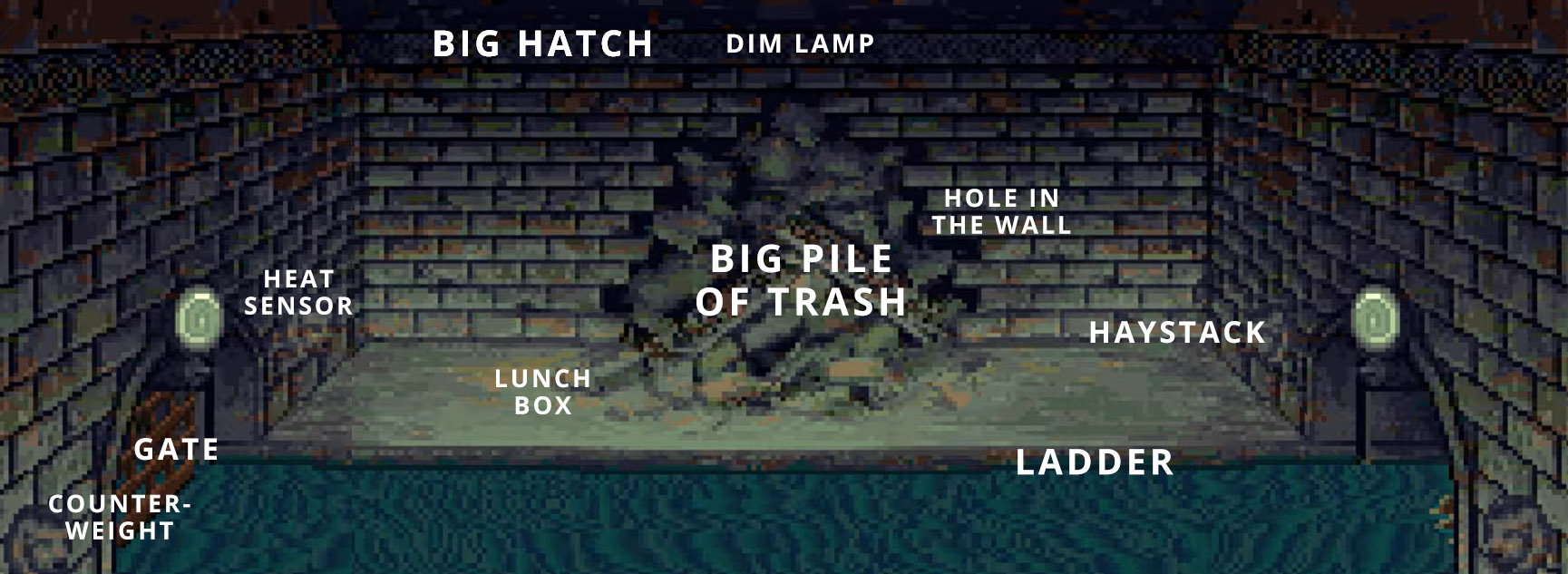 First vision of Sewer room #2
Background graphics © LucasFilm Games, Disney
Next, I gave the pic above to my team’s graphicians. Quickly – and with a legacy 320 x 240 aspect ratio in mind – one of them made the following first draft:
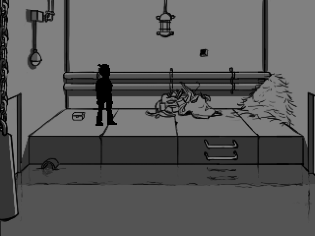
This was the first time I ever saw a version of a background for my game and instantly the project seemed more real.
My mind, however, was blown only when our concept artist Tuomas Korpi came up with this:
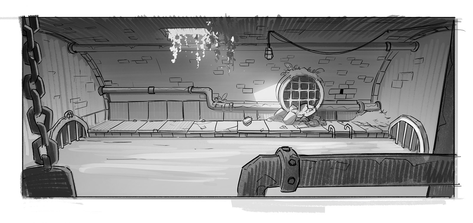
All right, this was really beginning to go somewhere! We used the above background as the first asset in our Unity project and it remained there for a good while… until the first pixel art version was created by a third graphician. We also got to see it in colours for the first time (this version of the protagonist was shorter than the character is in the final game)!
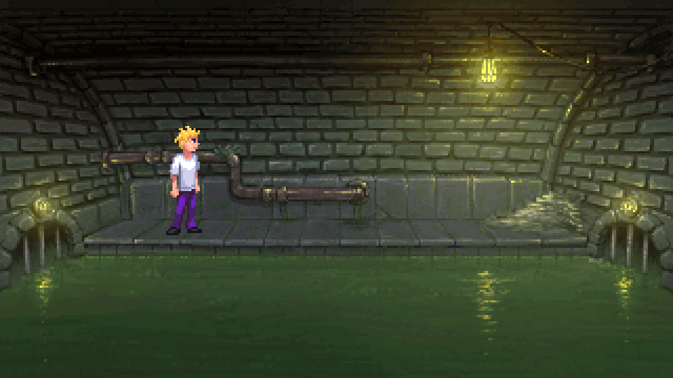
The version above was pretty much done with my first reference image (FoA) in mind, so a rather realistic take on the matter.
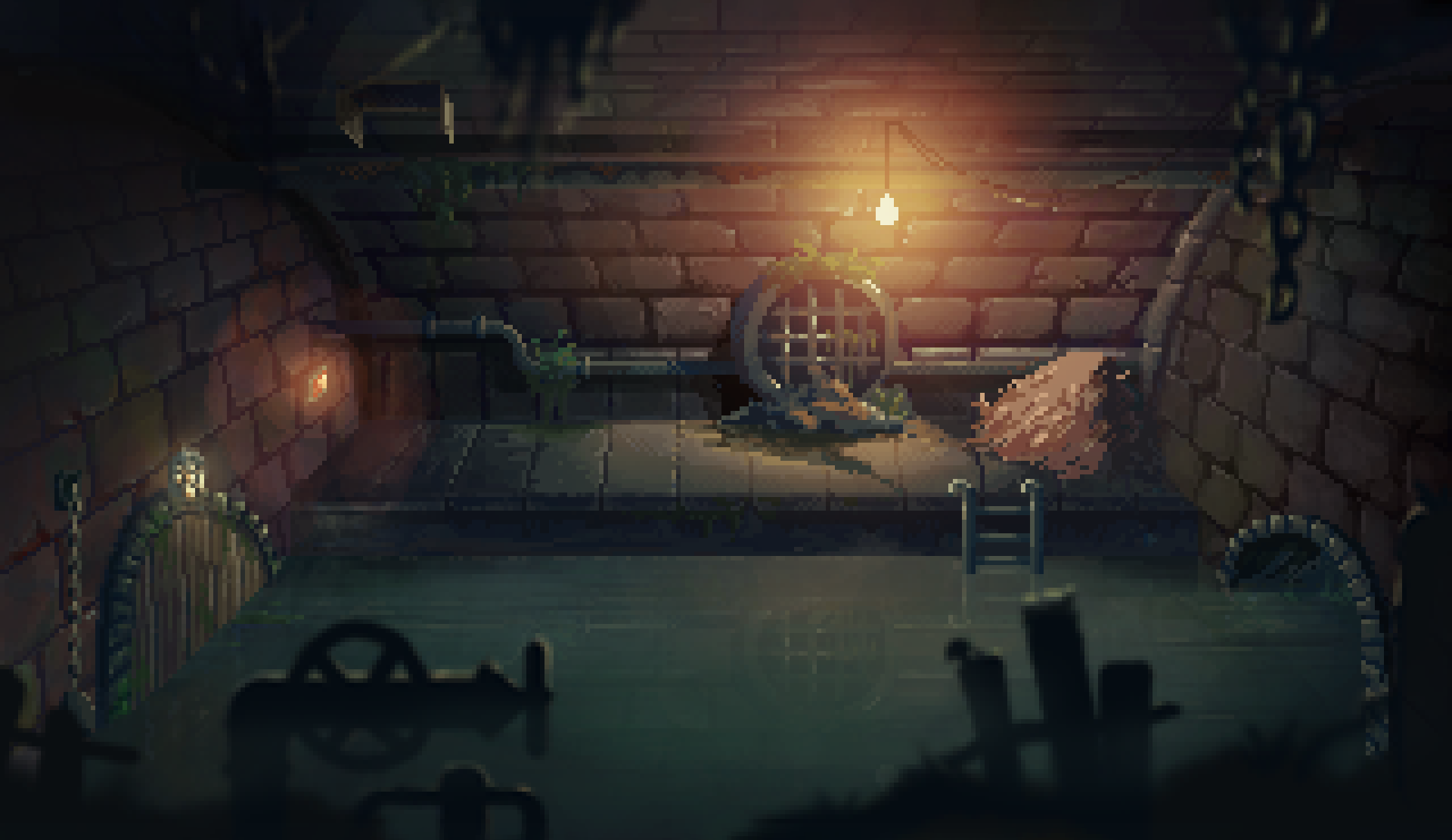
At this stage, it was time to really start thinking about the visual style for the game. We had decided to go with 320 x 180 aspect ratio in order to nicely fit the modern 16:9 screens. It was then when I found another spectacular background artist anokaki and asked him to join us – which he did, to my pleasant surprise. We had a lengthy discussion and his first version already added a great amount of style to the room:
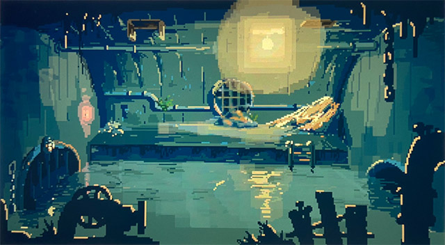
It was such a joy seeing this, but the goofy looking piping in the foreground kind of took you straight to Day of the Tentacle, or that’s what I thought. DoTT is a game I love to bits, but I didn’t want to go to such level of cartooniness here. So what WAS the style I was going for?
To clarify things, one of our team members handed me this image and asked me to do a tone chart, so I quickly placed SIXT among some great LucasArts titles:
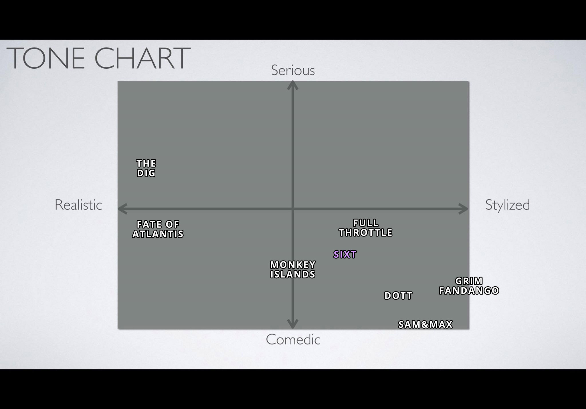
I stress the word quickly here – I would have to change the positions a bit if I really wanted to make the chart accurate.
The artist’s next version? Well… you’ve seen it already. 🙂
-luuk
No Comments