
24th Mar 2023 A smooth ride
BOY, THAT'S SMOOTH. SMOOTH AS SHIT FROM A DUCK'S ASS!
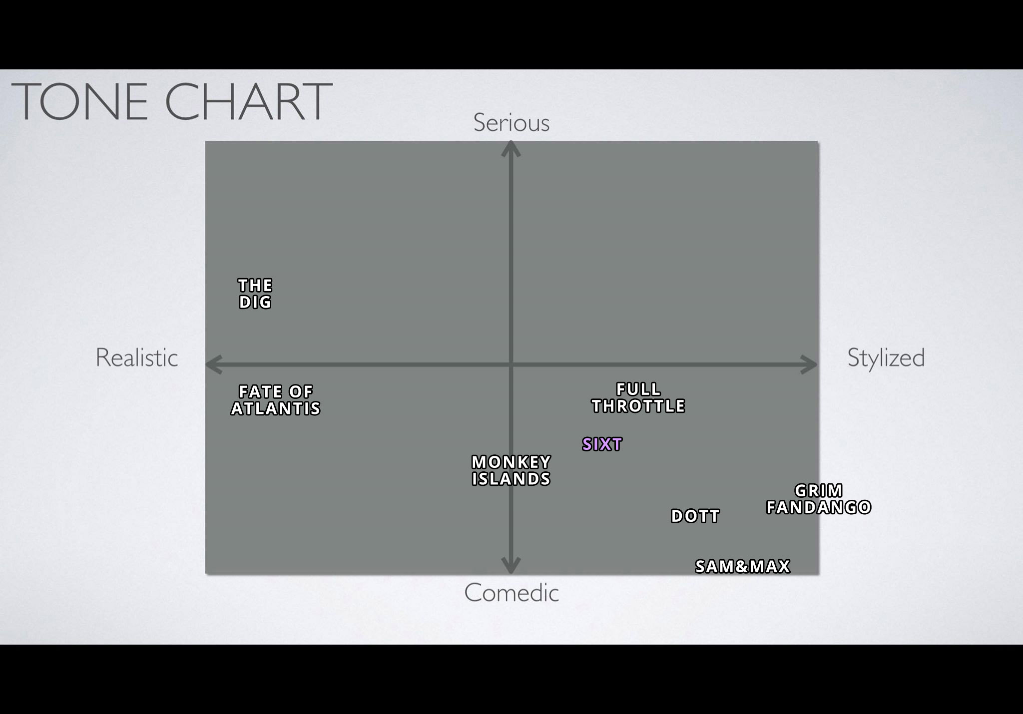
The Dig (1995) is one of a kind in the amazing list of point & click adventure games from LucasArts. I posted this tone chart in an earlier update, too, but here it is again: The Dig is perhaps the only game of the bunch I’d deem more serious than comedic (Fate of Atlantis is really the only other one that comes close, but I’d say it’s still funnier than The Dig). There is some dry humour in The Dig, of course, but the game is quite realistic (well, as realistic as a sci-fi game taking place in another galaxy can be) and mostly about exploration and isolation. There are always exceptions, but those themes are often a better fit for dramas than comedies.
This post is not about tone, though. Since day one of Sixtus Flaming’s modern development, The Dig has been my most important reference overall (if you don’t count Monkey Island 1 & 2). And when it comes to the User Interface of our game, even more so. The UI of Sixtus Flaming is basically The Dig’s, with a touch of Delores (Ron Gilbert’s unofficial mini-sequel to Thimbleweed Park) coupled with Sierra-esque symbols.
SMOOTH GAMEPLAY EXPERIENCE
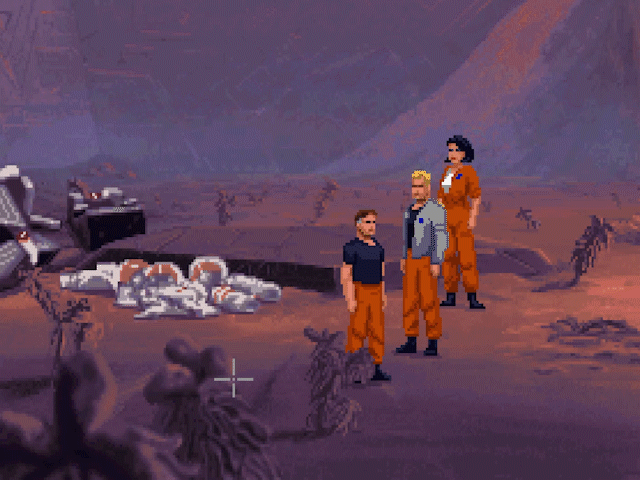
The smooth walking animation in The Dig
© LucasFilm Games, Disney
What I always found groundbreaking and inviting in The Dig back in 1995 was surely the previously unseen smoothness of animation (even turning around before walking was animated), but even more so, the smoothness of gameplay: as soon as I got an idea, I could move to another place and try the idea in practice almost right away, while most games of the era would require the player to patiently wait as the character walks through different scenes before trying things out. Having a double-click cause instantaneous scene switch helped a lot.
Now that I played The Dig again in 2023, especially after experiencing the lightning-fast movement of Guybrush basically flying through the scenes in Return to Monkey Island, it was funny to realize that the walking in The Dig, smooth as the animation still looks, is slow as hell. It takes a LONG time to walk through a room. There’s no double-speed movement by double-clicking or anything like that in The Dig, double-click only works for room exit. We’ve come a long way.
Now, some would argue it’s actually a good thing that it takes a longer time, as that, in a way, forces you think more about what you want to try next. While I absolutely agree that our attention span as a species is decreasing at an alarming rate, I think having a slow walking speed is NOT the best way to tackle this issue. Instead, making the gameplay as smooth as possible and enabling player to feel good about playing a point & click adventure game, where the only way to advance is to use your brain, THAT is a way to grow the attention span.
USER INTERFACE
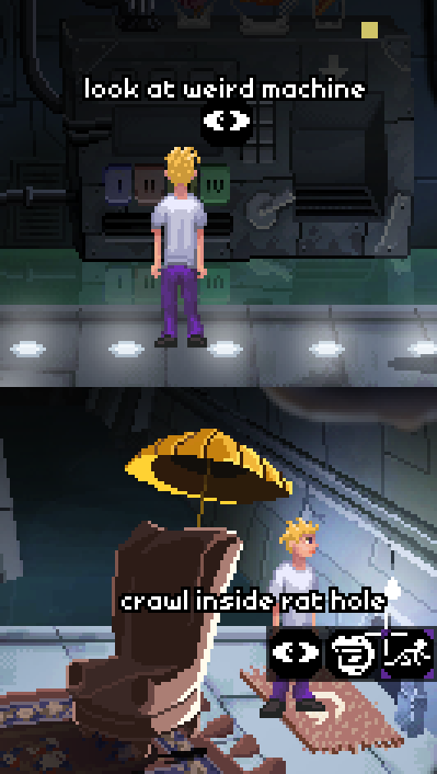
Sixtus Flaming’s context-driven user interface
Many people who love P&C adventures also love the classic verbs interface, introduced by Maniac Mansion in 1987. Nevertheless, after Day of the Tentacle in 1993, LucasArts decided to abandon it. They first tried a Sierra-inspired changing cursor interface in Sam & Max and next, a pie menu in Full Throttle. With The Dig, however, they came up with the most simplistic approach possible. You simply notice something, POINT at it and CLICK. If it’s possible to pick it up, that’s what happens. If you’re able to push it or use it, that’s what happens. And if you’re just supposed to look at it, the protagonist Boston Low will tell you all about it.
People have argued that this system takes the simplicity too far: you don’t get to decide for yourself what to do with the stuff you come across! Nevertheless, The Dig is widely considered perhaps the most difficult game by LucasArts, so simplistic controls don’t necessarily mean that the game is easy.
Well, I don’t want to take things quite as far as The Dig, but I don’t see the point of enabling the player to attempt to give shovel to door or talk to cupboard either. That’s why with Sixtus Flaming, we’re going with a context-based approach. If it’s only possible to do one thing, like look at an object, then that’s all you’re given. If there are more things you can try, then those choices will be there for you. And if you like verbs, have we got verbs for you! Crawl inside (see image) is just an example here – in the demo, we currently have 22 different actions available and I believe we’ll still add a few more before we’re done with the demo. The final game will likely have at least 50+ possible actions. That’s what going context-based enables you to do. More flexibility.
With dialogue, we’ll go with the good old classic style where you can read the exact responses beforehand and choose from them instead of a vague image referring to a possible topic. Return to Monkey Island also favoured this vintage approach.
INVENTORY
With all that said, I think people could easily play our game and never know The Dig was a major influence… if it wasn’t for the inventory. I love the inventory of The Dig and have not seen a better take on it in an adventure game anywhere, which is why we’re using an almost identical one in Sixtus Flaming.
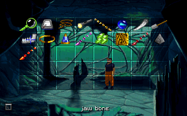
Inventory view in The Dig
© LucasFilm Games, Disney
Having an inventory onscreen all the time next to the verbs or something like that is obviously handy, but how cool is a fullscreen game view? P&C adventures that have that pretty much always sport an appearing inventory that fills the screen while it’s open. Return to Monkey Island’s inventory only fills half the screen. That’s a step to the right direction. What’s different in The Dig is that the appearing inventory is transparent, so you never lose sight of the room you’re in. Also it’s kind of nice being able to move the inventory items freely around the possible slots.
The only design flaw in The Dig’s inventory in my opinion has to do with examining inventory items: you have to pick one of the items, a magnifying glass, as your cursor in order to examine any of the other inventory items. As most players will likely look at their inventory items time and time again, that’s an unnecessary extra click you have to do each time. I think it makes sense to smoothen even the smallest things. That’s why in our inventory, you only need to use mouse-right to examine an object (when it comes to porting, we’ll have to come up with a clever way to do the same with other devices).
IN CONCLUSION
All of the UI choices mentioned above are obviously OK and you can make a good game using any one of them. We’ve chosen the ones we like the most for this game. But for example, I sure love Monkey Island 1 & 2 exactly as they are and wouldn’t want them to be modernized in any way. Just as Rick and Ilsa will always have Paris, we will always have the precious original Monkey Islands. But where we go from there can be something else entirely.
-luuk
BOY, THAT'S SMOOTH. SMOOTH AS SHIT FROM A DUCK'S ASS!
The Dig (1995) is one of a kind in the amazing list of point & click adventure games from LucasArts. I posted this tone chart in an earlier update, too, but here it is again: The Dig is perhaps the only game of the bunch I’d deem more serious than comedic (Fate of Atlantis is really the only other one that comes close, but I’d say it’s still funnier than The Dig). There is some dry humour in The Dig, of course, but the game is quite realistic (well, as realistic as a sci-fi game taking place in another galaxy can be) and mostly about exploration and isolation. There are always exceptions, but those themes are often a better fit for dramas than comedies.
This post is not about tone, though. Since day one of Sixtus Flaming’s modern development, The Dig has been my most important reference overall (if you don’t count Monkey Island 1 & 2). And when it comes to the User Interface of our game, even more so. The UI of Sixtus Flaming is basically The Dig’s, with a touch of Delores (Ron Gilbert’s unofficial mini-sequel to Thimbleweed Park) coupled with Sierra-esque symbols.
SMOOTH GAMEPLAY EXPERIENCE
The smooth walking animation in The Dig
© LucasFilm Games, Disney
What I always found groundbreaking and inviting in The Dig back in 1995 was surely the previously unseen smoothness of animation (even turning around before walking was animated), but even more so, the smoothness of gameplay: as soon as I got an idea, I could move to another place and try the idea in practice almost right away, while most games of the era would require the player to patiently wait as the character walks through different scenes before trying things out. Having a double-click cause instantaneous scene switch helped a lot.
Now that I played The Dig again in 2023, especially after experiencing the lightning-fast movement of Guybrush basically flying through the scenes in Return to Monkey Island, it was funny to realize that the walking in The Dig, smooth as the animation still looks, is slow as hell. It takes a LONG time to walk through a room. There’s no double-speed movement by double-clicking or anything like that in The Dig, double-click only works for room exit. We’ve come a long way.
Now, some would argue it’s actually a good thing that it takes a longer time, as that, in a way, forces you think more about what you want to try next. While I absolutely agree that our attention span as a species is decreasing at an alarming rate, I think having a slow walking speed is NOT the best way to tackle this issue. Instead, making the gameplay as smooth as possible and enabling player to feel good about playing a point & click adventure game, where the only way to advance is to use your brain, THAT is a way to grow the attention span.
USER INTERFACE
Sixtus Flaming’s context-driven user interface
Many people who love P&C adventures also love the classic verbs interface, introduced by Maniac Mansion in 1987. Nevertheless, after Day of the Tentacle in 1993, LucasArts decided to abandon it. They first tried a Sierra-inspired changing cursor interface in Sam & Max and next, a pie menu in Full Throttle. With The Dig, however, they came up with the most simplistic approach possible. You simply notice something, POINT at it and CLICK. If it’s possible to pick it up, that’s what happens. If you’re able to push it or use it, that’s what happens. And if you’re just supposed to look at it, the protagonist Boston Low will tell you all about it.
People have argued that this system takes the simplicity too far: you don’t get to decide for yourself what to do with the stuff you come across! Nevertheless, The Dig is widely considered perhaps the most difficult game by LucasArts, so simplistic controls don’t necessarily mean that the game is easy.
Well, I don’t want to take things quite as far as The Dig, but I don’t see the point of enabling the player to attempt to give shovel to door or talk to cupboard either. That’s why with Sixtus Flaming, we’re going with a context-based approach. If it’s only possible to do one thing, like look at an object, then that’s all you’re given. If there are more things you can try, then those choices will be there for you. And if you like verbs, have we got verbs for you! Crawl inside (see image) is just an example here – in the demo, we currently have 22 different actions available and I believe we’ll still add a few more before we’re done with the demo. The final game will likely have at least 50+ possible actions. That’s what going context-based enables you to do. More flexibility.
With dialogue, we’ll go with the good old classic style where you can read the exact responses beforehand and choose from them instead of a vague image referring to a possible topic. Return to Monkey Island also favoured this vintage approach.
INVENTORY
With all that said, I think people could easily play our game and never know The Dig was a major influence… if it wasn’t for the inventory. I love the inventory of The Dig and have not seen a better take on it in an adventure game anywhere, which is why we’re using an almost identical one in Sixtus Flaming.
Inventory view in The Dig
© LucasFilm Games, Disney
Having an inventory onscreen all the time next to the verbs or something like that is obviously handy, but how cool is a fullscreen game view? P&C adventures that have that pretty much always sport an appearing inventory that fills the screen while it’s open. Return to Monkey Island’s inventory only fills half the screen. That’s a step to the right direction. What’s different in The Dig is that the appearing inventory is transparent, so you never lose sight of the room you’re in. Also it’s kind of nice being able to move the inventory items freely around the possible slots.
The only design flaw in The Dig’s inventory in my opinion has to do with examining inventory items: you have to pick one of the items, a magnifying glass, as your cursor in order to examine any of the other inventory items. As most players will likely look at their inventory items time and time again, that’s an unnecessary extra click you have to do each time. I think it makes sense to smoothen even the smallest things. That’s why in our inventory, you only need to use mouse-right to examine an object (when it comes to porting, we’ll have to come up with a clever way to do the same with other devices).
IN CONCLUSION
All of the UI choices mentioned above are obviously OK and you can make a good game using any one of them. We’ve chosen the ones we like the most for this game. But for example, I sure love Monkey Island 1 & 2 exactly as they are and wouldn’t want them to be modernized in any way. Just as Rick and Ilsa will always have Paris, we will always have the precious original Monkey Islands. But where we go from there can be something else entirely.
-luuk
No Comments